Este artigo está tamén dispoñible en galego
Sastre’s tale, a hybrid typeface
by María Ramos
Can someone tell a story as it happened? How real is a memory? When we talk about the past, we build a narrative. What we tell includes facts but also interpretations rooted in the emotions that stay with us over time.
The story of Sastre, the typeface we are presenting here, began over a decade ago. What I am about to share is not merely the design process, but a collection of memories that mix evidence and feelings.
Origin: the design
Sastre was born in 2014 in England. I moved there to complete the MA in Type Design at the University of Reading. The initial sketches, made in pencil on paper, stemmed from a rather basic idea: to design a typeface drawn entirely with curved lines. To add to the concept, there were two additional conditions. The first was related to function; the typeface was intended for text use, so it should be comfortable to read at small sizes and long paragraphs. The second was linked to aesthetics; by experimenting with geometry, I developed a broken structure built on a different number of nodes for shapes and countershapes. This geometric skeleton would also apply to the italics, with a simplified node structure that would enhance angularity and a distinct expression for that style.
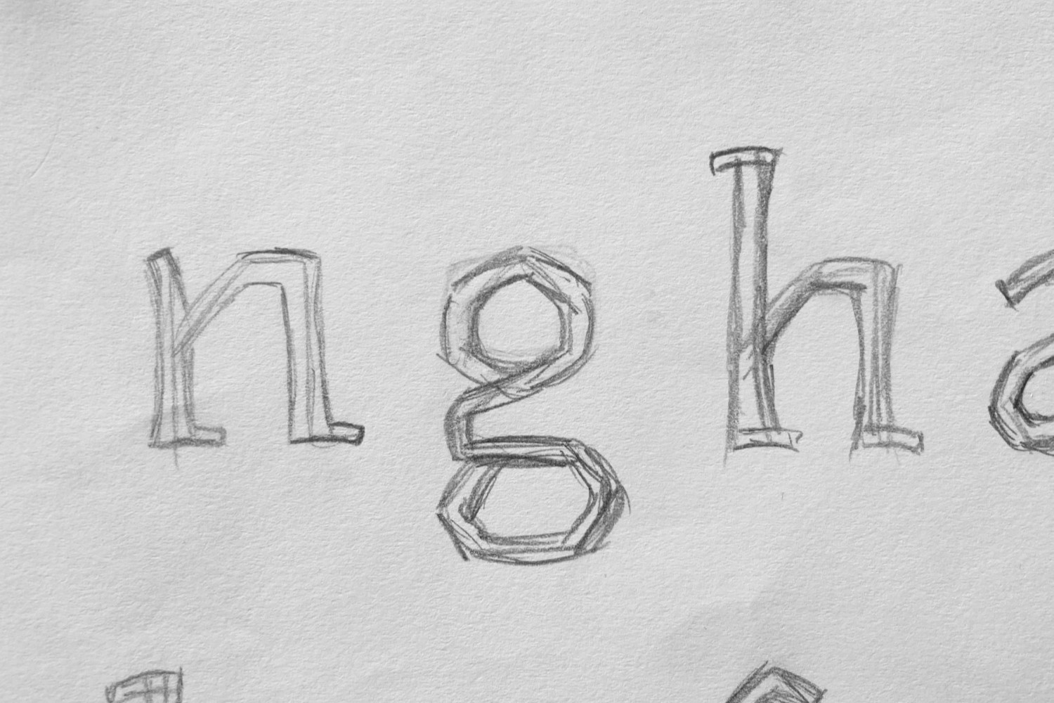
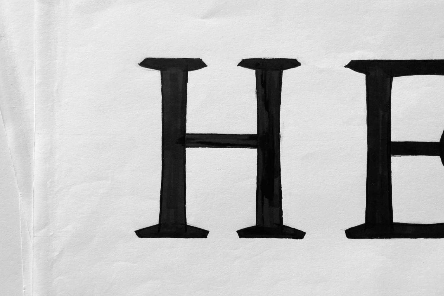
These essential rules evolved with the project, being flexible when needed. For instance, the wavy lines on the baseline proved uncomfortable to the eye, so the characters were adjusted to lie on straight paths. This new feature also applies to other horizontal strokes, such as bars and arms. By calming the extreme dynamism in the design, I was able to simplify the skeleton complexity and improve the typeface functionality.
Evolution: the references
The geometry behind the letterform’s construction sparked an unconscious search for visual references that could lead or transform the design process. The broken structure in Sastre emerged in various places.
Nature became a rich source of inspiration. If we look at a leaf against the sunlight, we can discover countless interconnected lines that form squares, diamonds, triangles, and circles. These organic shapes repeat endlessly in an almost magical way. The fragmented structure is so intricate that we ultimately perceive the complete shape and not the individual paths. That is exactly what happens with Sastre; the complex contours go unnoticed when set at small sizes.
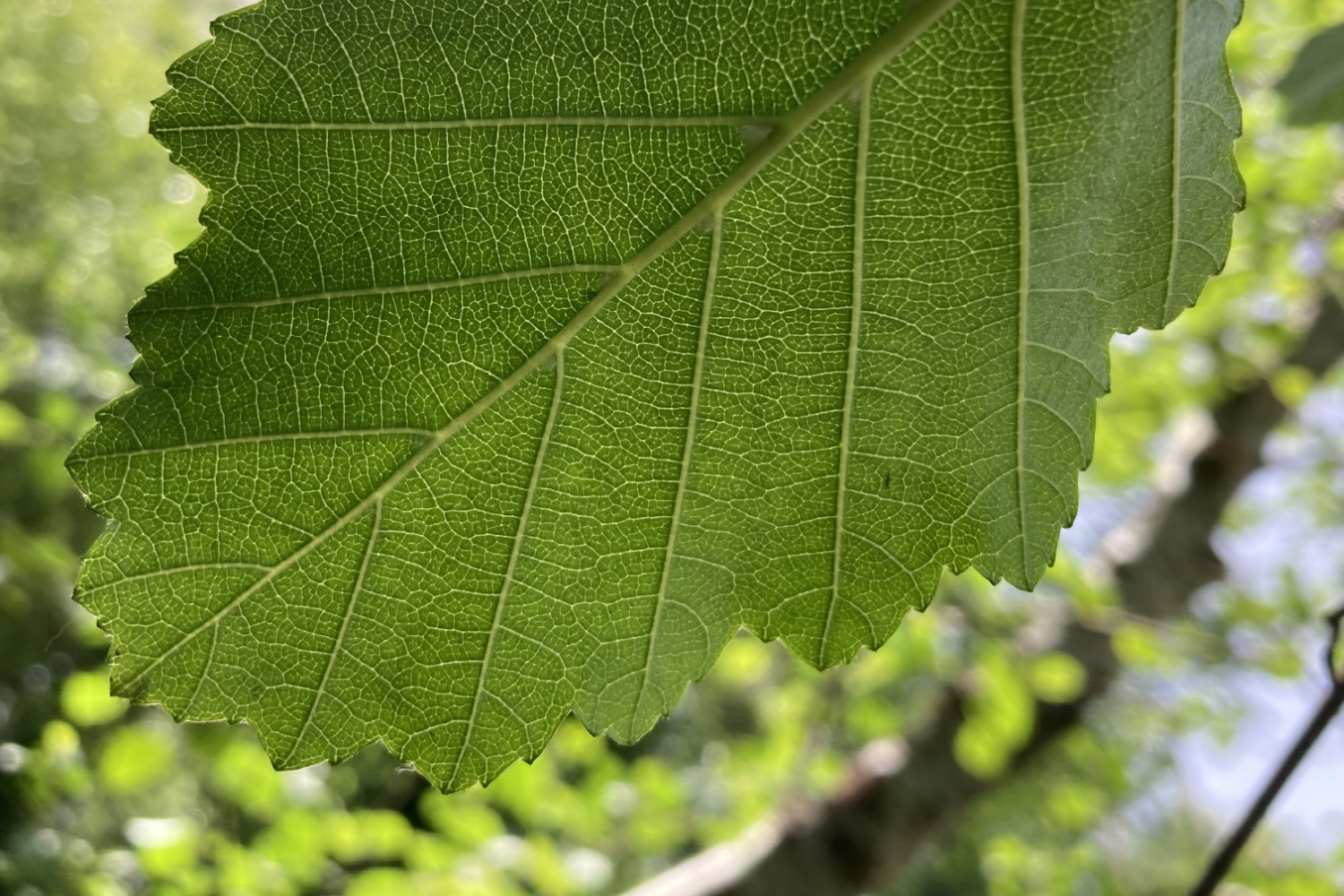
Fig. 3 Alder’s leaf in Santiago de Compostela
Photo by María RamosDrawing again on memories and the impact a new place has on you, I recall my first weeks in Reading, when I discovered an unexpected appreciation for something apparently mundane: spider webs. There were plenty of them on my way to campus, and I was amazed by their complex structures and huge dimensions. The interconnected threads form abstract geometric compositions, showcasing the impressive work of skilled weavers!
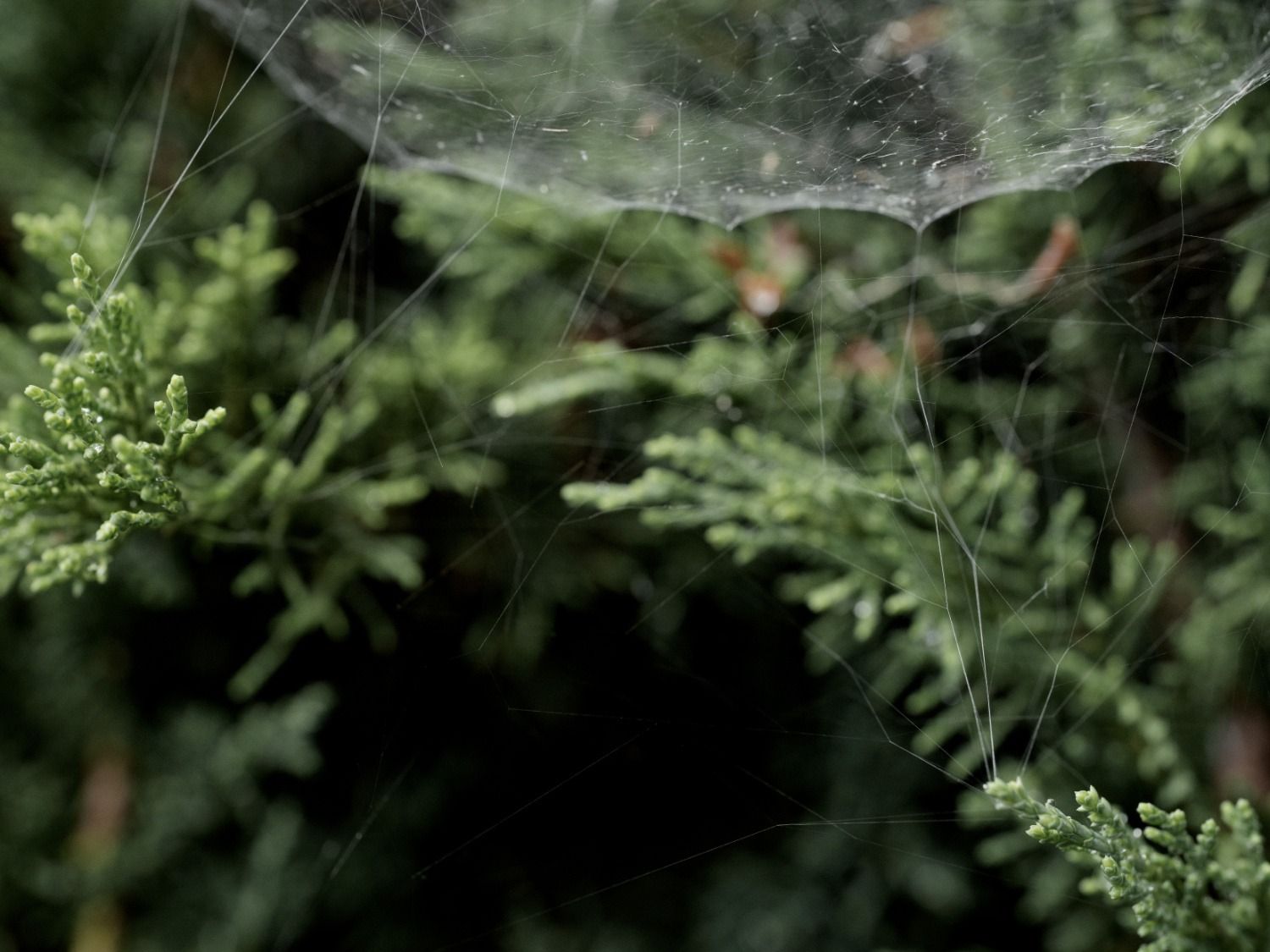
Spider web in Monte de Conxo Park (Santiago de Compostela)
Photo by Luis Díaz DíazGeometry, rooted in mathematics at the beginning, took on a fresh perspective. I moved away from strict numerical precision and embraced a more intuitive approach for shaping letterforms.
This new vision, grounded in sensibility, unveiled something that had likely been present from the very beginning, something tied to my personal experience and connected to my family. The broken outlines and subtle curves reminded me of the tailor’s chalk drawings my father made on fabric at his workshop; lines that defined suits, jackets, vests, and trousers, adapted to fit each client’s body.
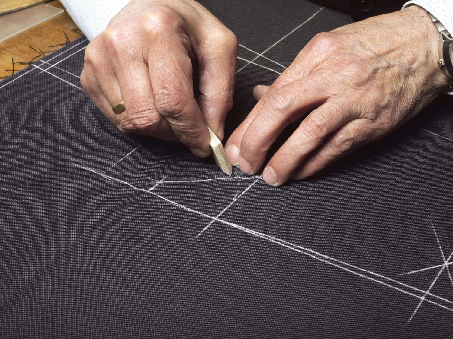
Manuel Ramos drawing on fabric at his workshop
Photo by Jesús MadriñánI’m not sure whether it was cause or effect, but the design evolved from this emotional connection. The project took a new dimension; there were new references to explore and a clear path to follow.
Release: the typeface
Sastre is a hybrid typeface, a concept used in 2015 by Professor Gerard Unger to discuss the mix of influences across design and art disciplines. Current digital processes facilitate exploration in type design. It is easier than ever to break free from type canons and take an experimental approach to create letterforms, including text typefaces. The connection to popular historical references is indeed alive, but revivals coexist today with new ways of shaping type.
Drawing from standard text typefaces, Sastre includes moderate contrast, an angled axis, and generous proportions. It combines the mechanical appearance of a wedge-serif with classic features of an old-style typeface. The design offers a fresh perspective by blending historical type characteristics with unconventional references, such as patterns found in nature and tailoring.
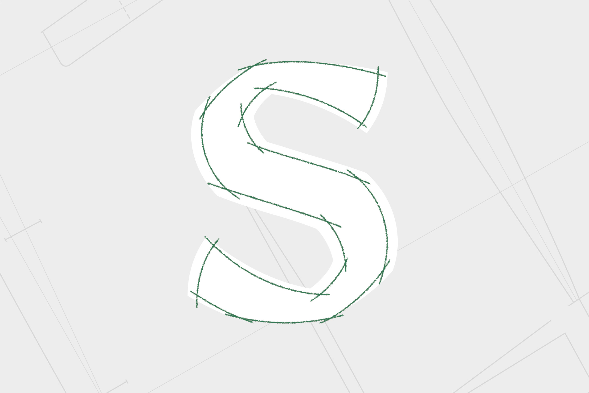
Contours of lowercase “s” in Sastre Medium above a heavier version in the variable font
Sastre’s long, meticulous creation process treated type design as a form of digital craftsmanship, leaving enough time to mould, contemplate, and evaluate every single character.
The type family introduces now the upright version, including five weights and one variable axis. The italic version and other display styles are currently a work in progress. They will follow up on the intricate tale of Sastre in the next months, maybe years, who knows.
We invite you to explore the website created to share more information about the project. Sastre is exclusively available in NM type.