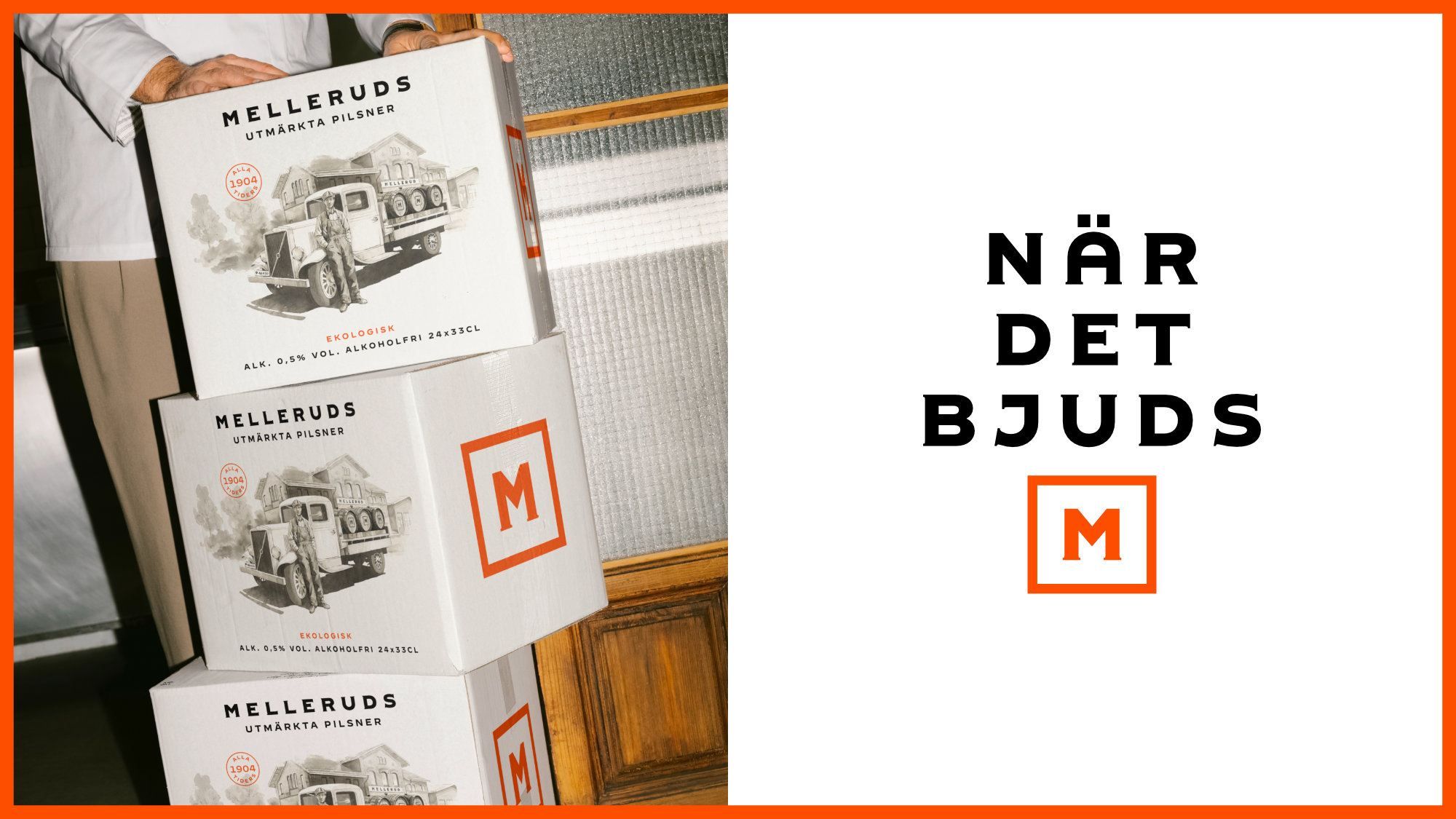
Melleruds is a premium pilsner with understated elegance and Swedish roots going back to 1904. In the new identity, the brand’s history comes to life through small, careful details.
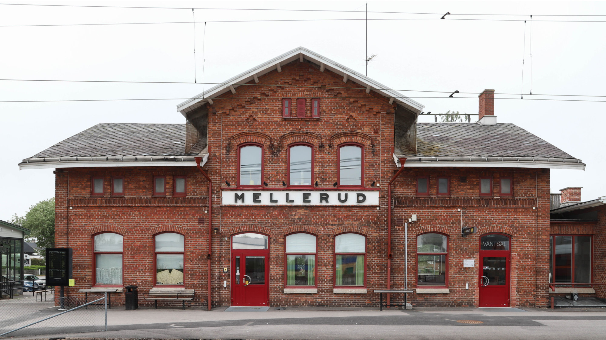
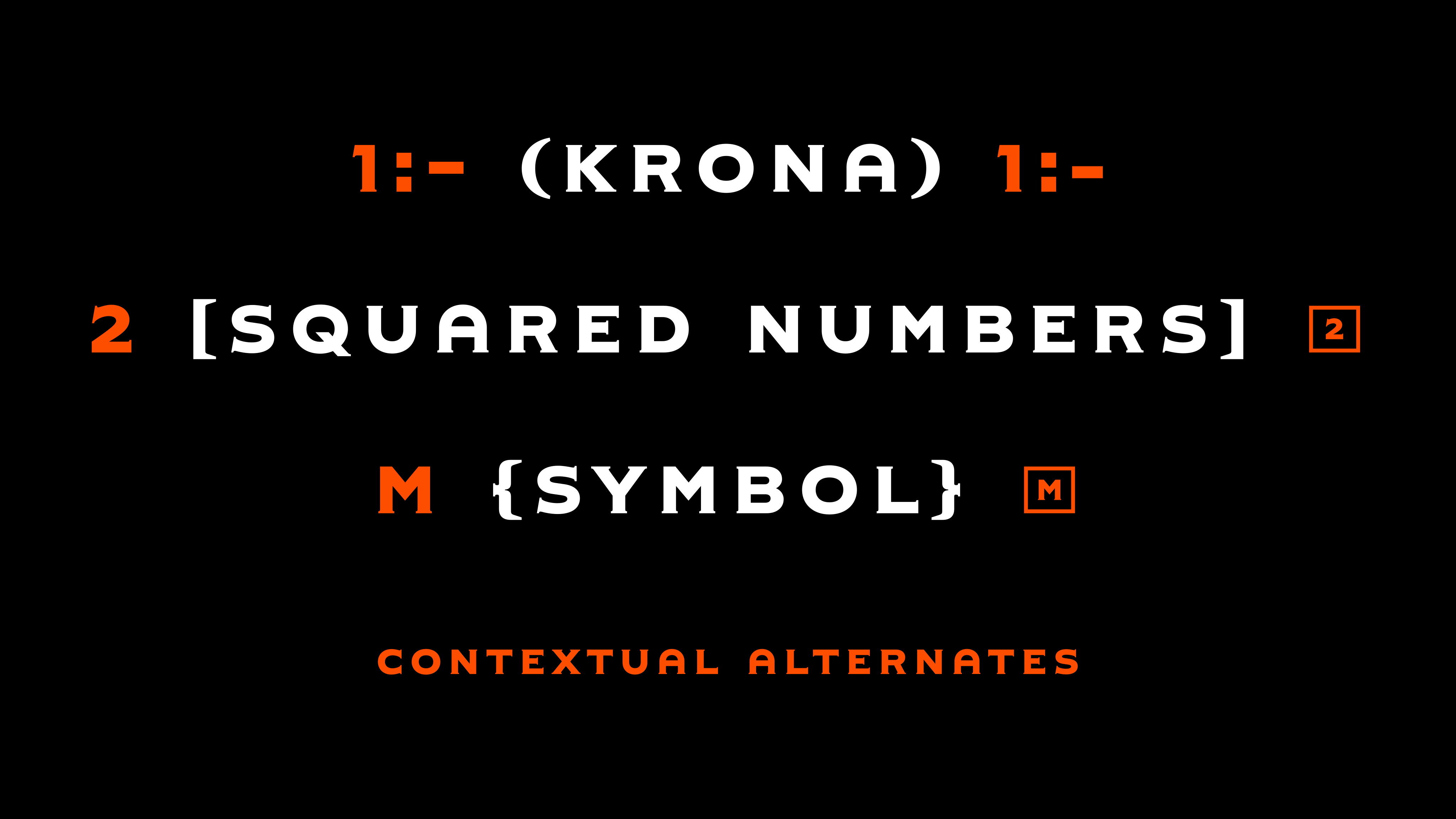
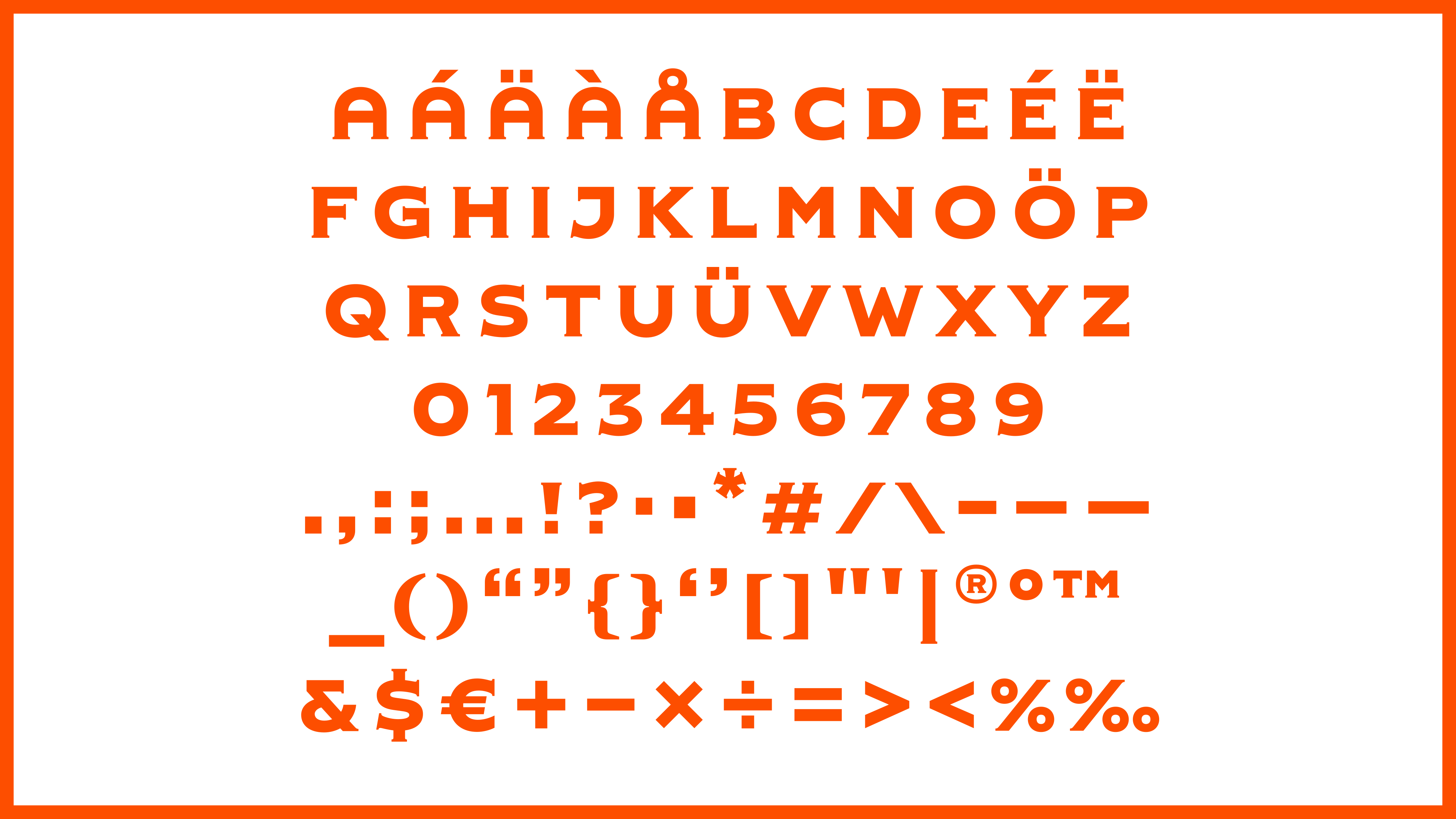
The starting point for the new custom typeface was the historic sign in Mellerud train station, a well-known landmark in the town that gave the beer its name. We studied the shapes of these letters and drew a typeface that keeps the sign’s honest, sturdy character while giving the brand a voice of its own.
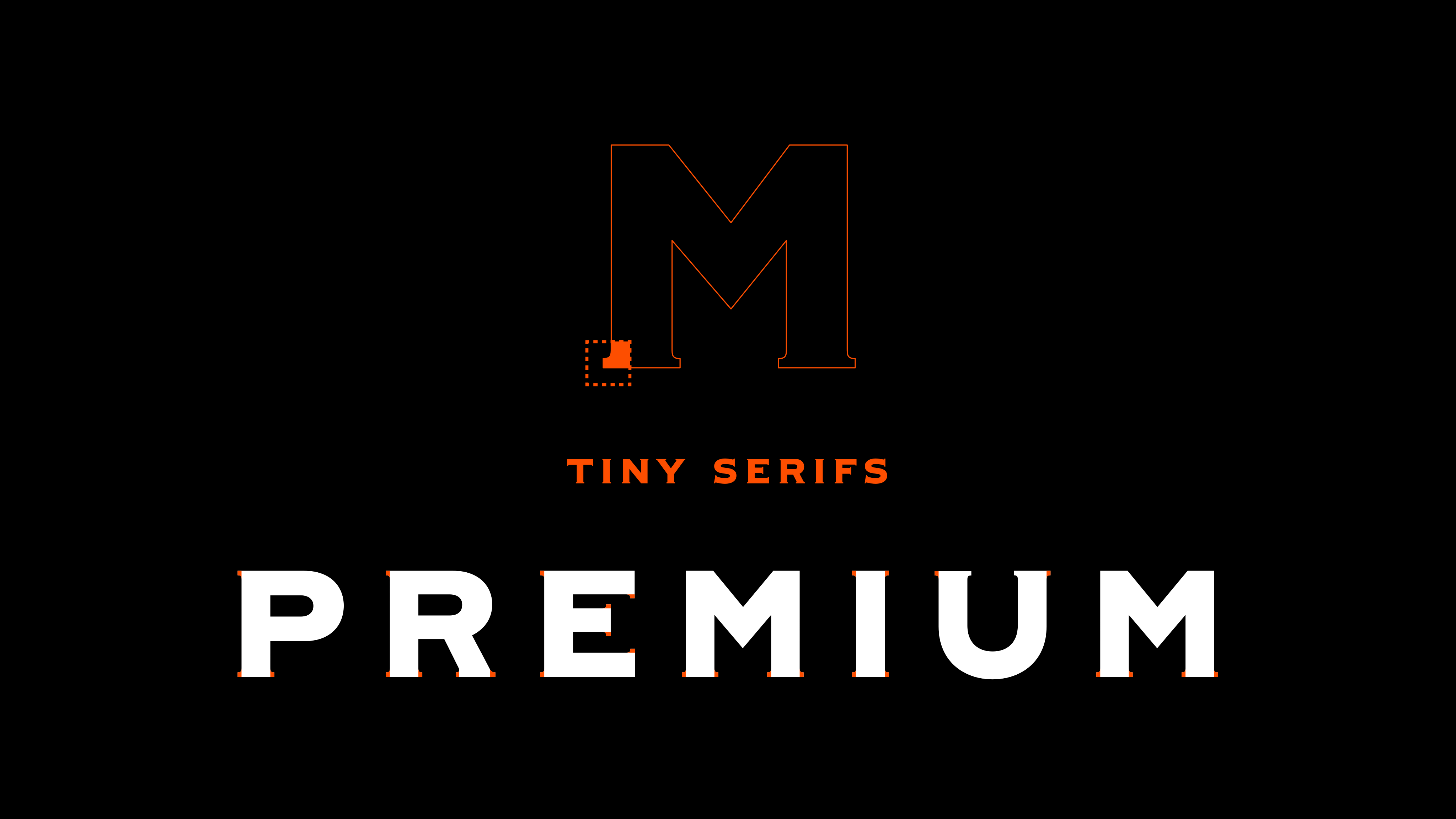
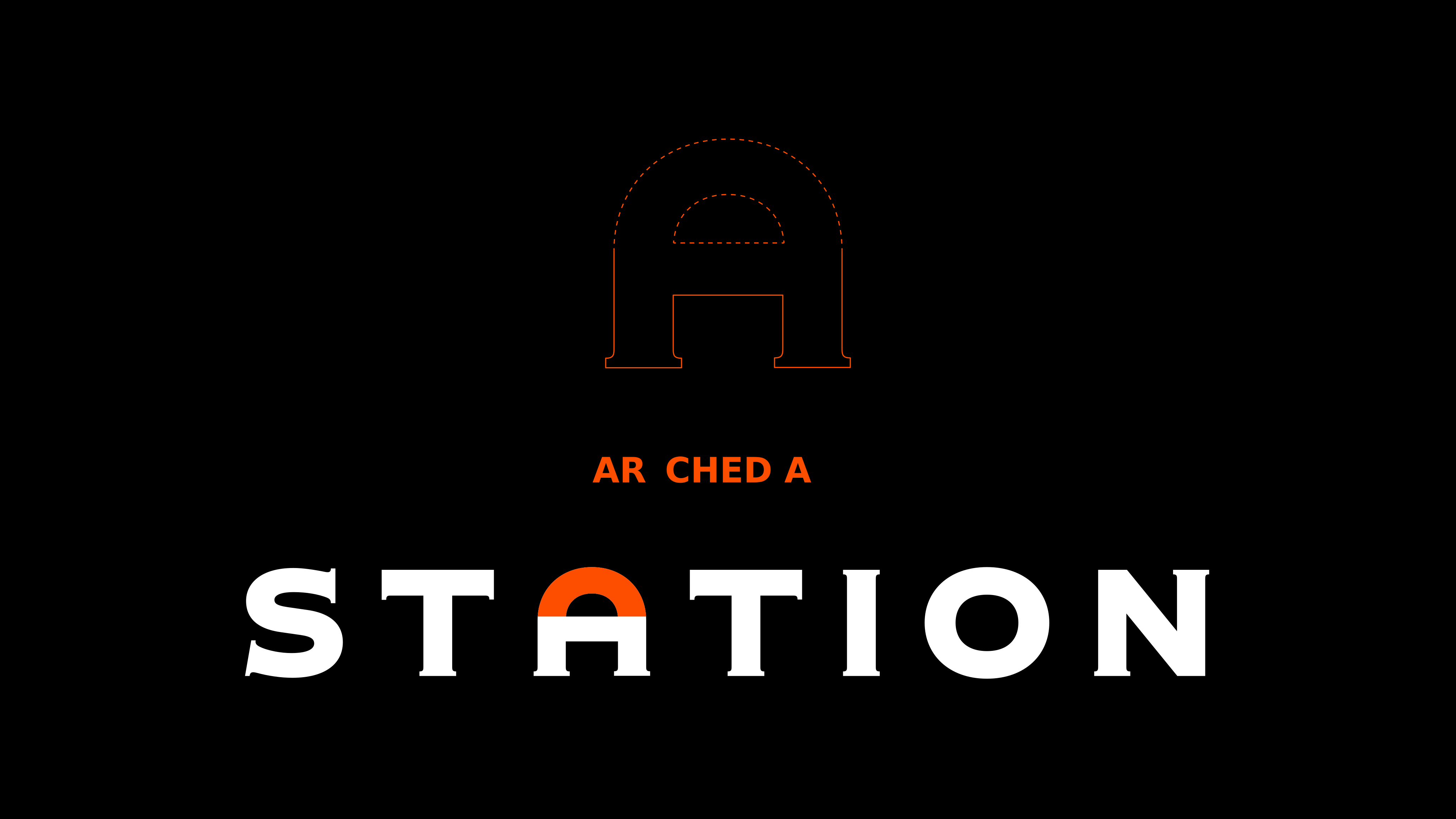
The same typeface also forms the Melleruds logotype, so brand and type speak with one voice. The letters are wide and confident, built from a few distinct features. The tiny serifs provide a local connection to the strong, confident shapes. The squarish proportions and smooth curves add calm and balance to the robust forms. Generous spacing gives each letter room to breathe and lends the typeface the relaxed, airy feel of classic signage.
- Client
- Spendrups Brewery
- Ad agency
- IW Agency
- Release
- 2026
- Type design
- Noel Pretorius & María Ramos