Sastre is a hybrid typeface where nature and craftsmanship meet. Its broken structure and generous proportions perform well in long-form text and at small sizes. While its character is distinctive, Sastre remains a dependable workhorse. Rather than echoing traditional forms, it reinterprets them and challenges conventional ideals of beauty and refinement in contemporary text typography.
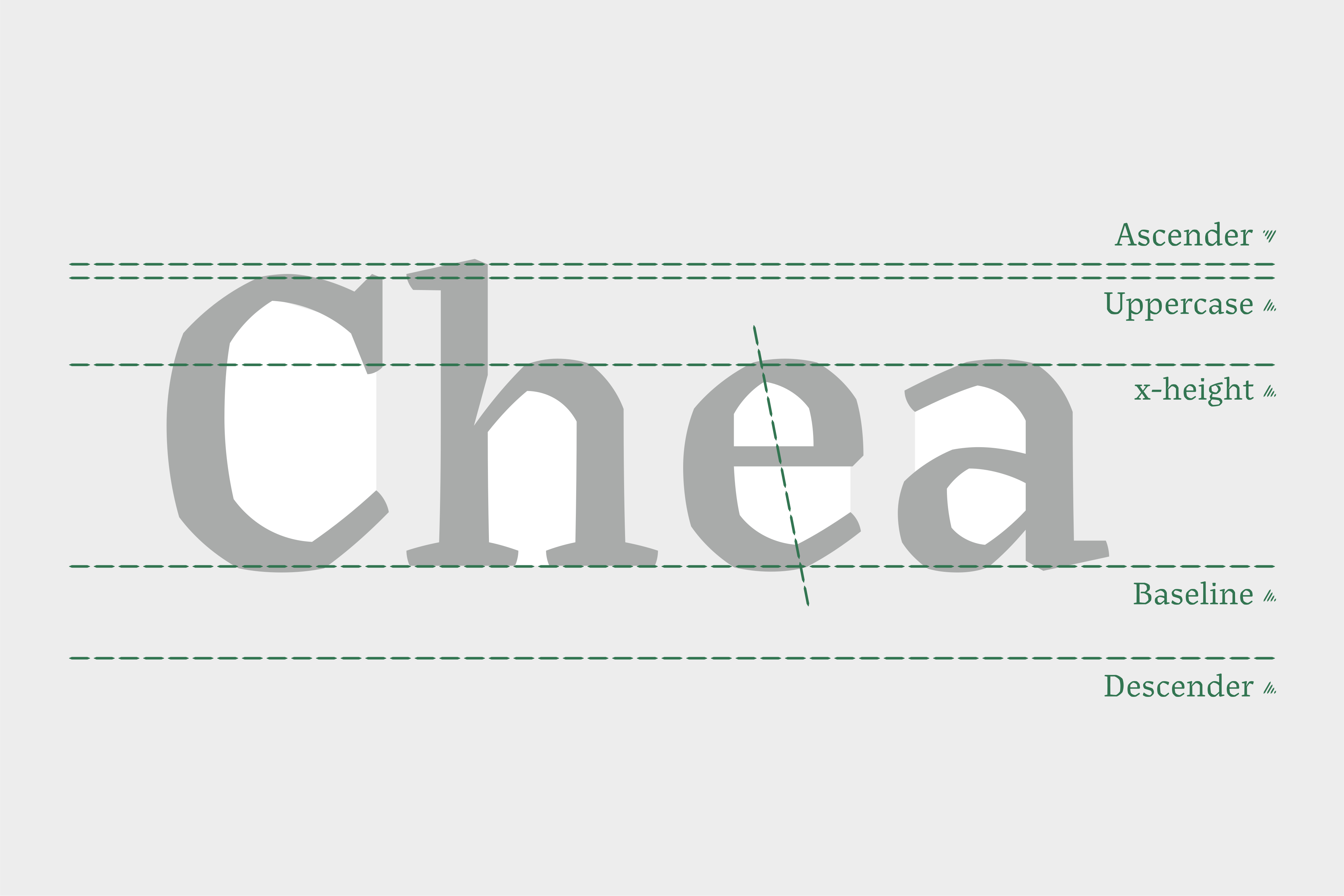
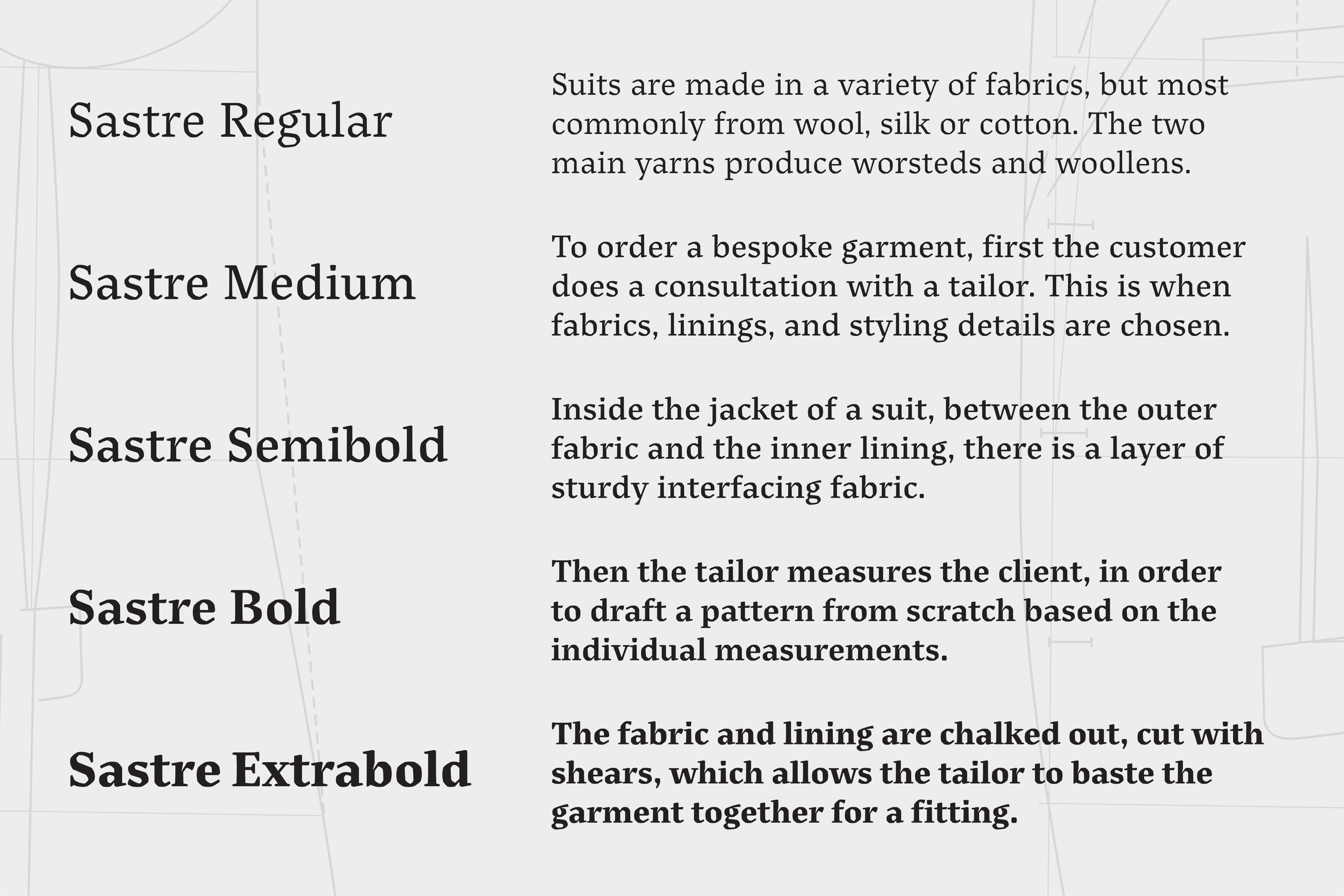
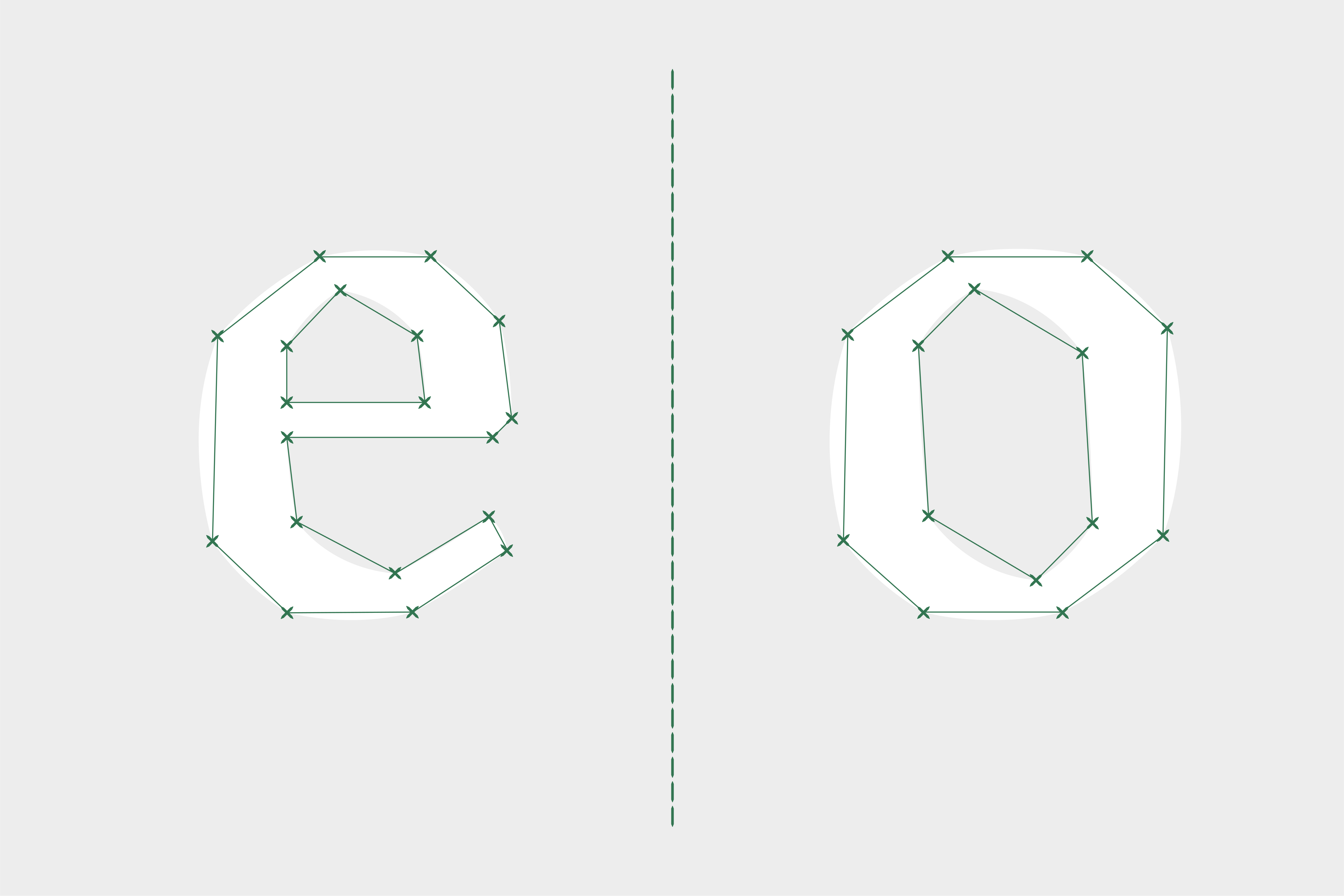
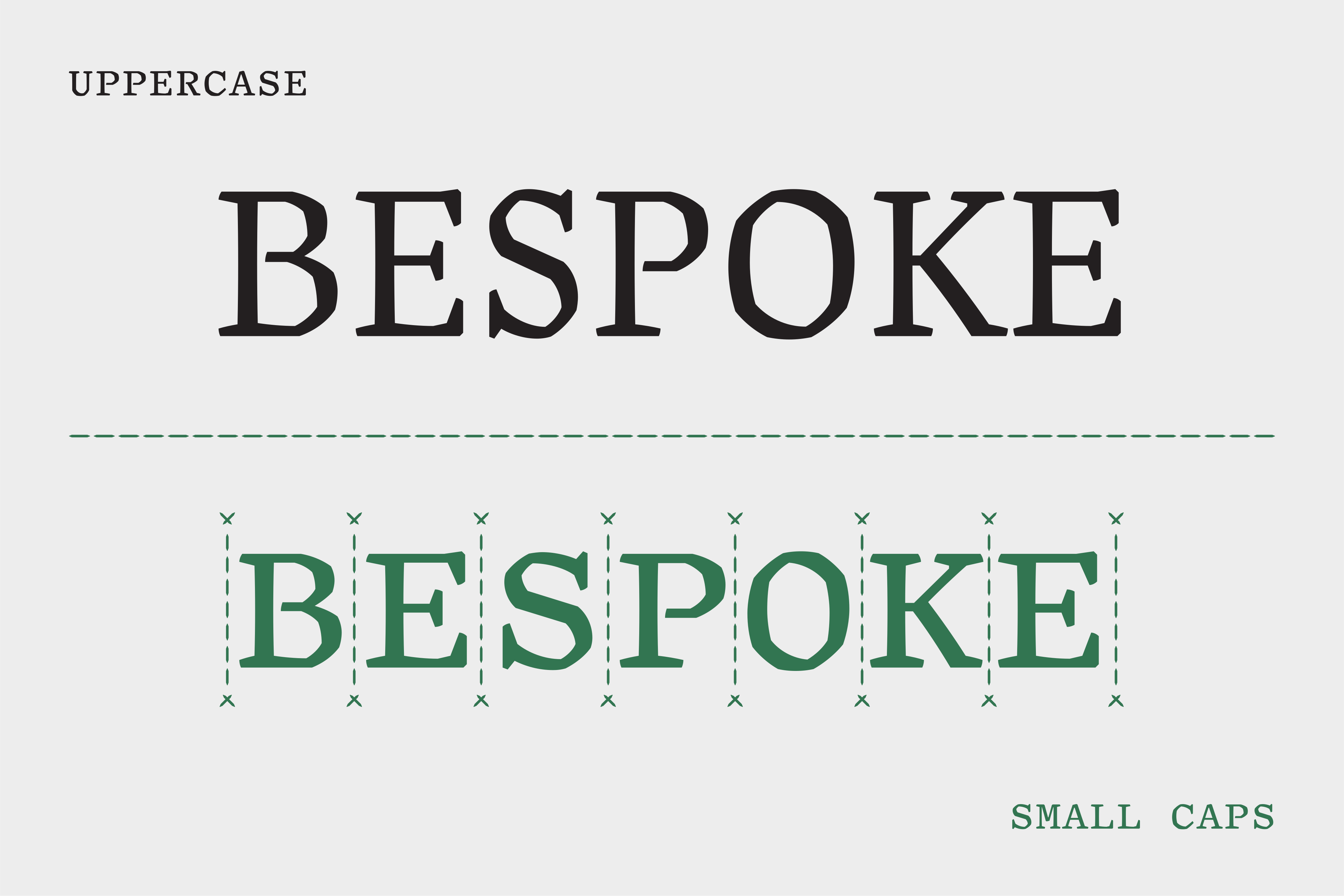
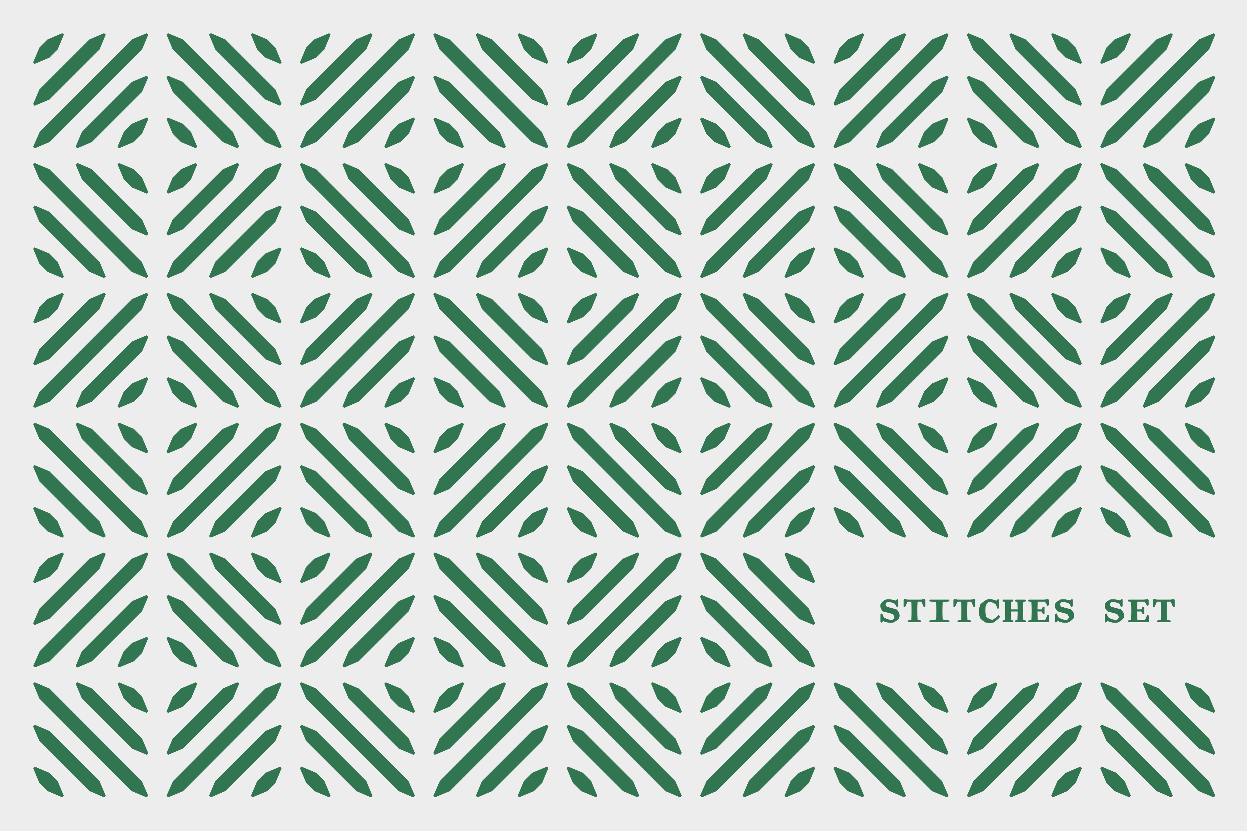
Sastre draws from typographic standards for text typefaces, such as moderate contrast, angled axis, and wide characters. It mixes the mechanical look of a wedge-serif with old-style design features, blending historical characteristics with unconventional influences. It is presented in five weights, from Regular to Extrabold. The large character set includes monospaced small caps, recommended for vertical type settings, and a collection of stitches, very useful for creating borders and patterns.
Born in 2014, while María was a student at the University of Reading, the type family received recognition at international awards, was featured in exhibitions, and used in commercial projects before the public release. The upright cuts and a variable font are now available for licensing, exclusively from NM type. The italic version is currently under development and will be released later.
Get to know more about the story of the project in our article Sastre’s tale, a hybrid typeface, and explore the typeface on the site we have created for the release.
- Script
- Latin
- Release
- 2026
- Type design
- María Ramos
- Specimen
- → Download PDF